
I designed a watch face to solve a real-world problem affecting me and (possibly) millions of others.
I wear glasses. Like many people, the last thing I do before going to sleep is take them off. But when I wake up in the middle of the night to check the time, standard watch faces are just an unreadable blur to me.
I didn’t need to know the second or even the exact minute. I realized that reading a precise digital number like “12:42” forced my brain to do a little math, engaging my mind just enough to actually wake me up. I wanted the “analog intuition” of just glancing at a shape and instantly knowing if I had time to go back to sleep using near-zero brain power.
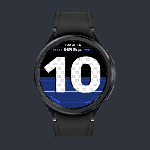
I wanted a design that solves a specific problem, so I built Peek Hour. It is purpose built to be readable without corrective lenses. I’ve been using Peek Hour for almost a year. Bringing this watch face to life was incredibly rewarding, and now it’s time to make it available to others:
- Huge Hour Display: The hour displays in a huge, thick and high contrast color making it as visible as possible.
- Designing “Fuzzy” Time: Because shapes matter more than numbers when your vision is a blur, I built a visual gauge into the background. The color “drains” from top to bottom as the hour progresses. Full color means it’s the top of the hour. Color in the bottom half means it’s 30 minutes past. Even if you can’t read the screen, the color ratio tells you the approximate minutes past the hour, which is “good enough” for telling the time at night.
- The “Peek” Mechanic: I still wanted digital precision for daytime use, so the exact minutes are neatly tucked right inside the giant hour digit. Even if those smaller numbers are a blur without your glasses, the secondary background gauge is always there to guide you.
- Extreme Battery Optimization: A massive hour digit normally uses too much power on an Always-On Display (AOD), even if the entire digit is dim. To solve this, I modified the vectors of the font to design a custom outline font with no fill. This allows the brightness to remain higher so it’s very readable, even though it only uses a maximum of 3.8% of the screen’s pixels (and a minimum of 1.5%). This is well under Google’s 15% limit. It keeps the screen highly visible without lighting up a dark room.
Peek Hour is my daily driver, day or night. While it keeps the display uncluttered, it hides plenty under the hood. Along with 19 color themes and a step tracker that turns progress dots into hearts for each 10% past your original goal, a battery indicator is also included right on-screen as well as the date. All options are tappable to get more info. It also features 3 complication slots (Long Text, Short Text, and an App Shortcut) that are hidden by default to preserve the minimalist aesthetic.
If you wear glasses, have contacts, or just appreciate incredibly clean, simple, yet powerful design, this may be the watch face you’re looking for.
Want more info? Check out the User Manual.


SHL Peek Hour Watch Face
Second Hand LabsCode distribution is powered by the SHL Promo Engine