
Contents
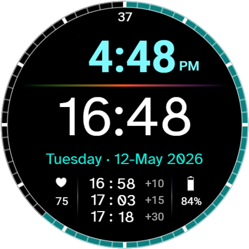
Most watch faces can be used by anyone, but designing a specialized nurse watch face requires a completely different approach. Typical watch faces show the time, the date, and complications or other stats that are pretty much standard across the board. From there, it usually comes down to personal style, readability, or just having those same familiar features arranged in different positions.
It is great that we have so many creative choices to fit individual tastes, but occasionally, a specific set of needs calls for a specialized watch face, not designed for everyone, but built intentionally for a targeted audience. Sometimes you can find an existing watch face that handles part of what you need, but not the rest, and in the end it is always a compromise.
About six months ago on Reddit, there was a post asking if anyone had a recommendation for a dedicated nurse watch face. Specifically, the only requirement was that the watch face displayed both 12-hour and 24-hour time simultaneously. When I started looking around, I was surprised that I could not find anything like that. It got me thinking: could I create a watch face specific to a particular industry, in this case nursing?
I have always had a fondness for the nursing field. When I attended college for business, my school also had a nursing program, and many of my friends in the dorms were studying to become nurses.
So when that request came in, it got me thinking beyond just showing a 12-hour and 24-hour clock. What else could a nurse possibly want on their wrist? The Wear OS Watch Face Format has a number of significant limitations, so I had to work within those boundaries. Still, what could be added that would genuinely improve the day-to-day routine of a nurse?
The Foundation: Dual Clocks and Atkinson Hyperlegible
The very first requirement I was given was having a 12-hour and 24-hour clock appear on the dial simultaneously. If nurses benefit from this feature so much, I wondered why it was so difficult to find other watch faces that offered it.
I placed the 12-hour clock on top in an accent tone with a softer, approachable look, and the 24-hour clock directly below it in bold, crisp white. For the 12-hour display, I used a clean, pleasant typeface that comes standard with Watch Face Studio.
For the 24-hour clock, I wanted something special. Because 24-hour time is used for charting and medical logs, it needed to be exceptionally legible with zero room for misinterpretation. Numbers should not look ambiguous; each digit needs to be distinct.
After some research, I found Atkinson Hyperlegible. It was developed by the Braille Institute specifically for high readability and character recognition for people with low vision. It turned out to be the exact solution I needed for the 24-hour display.
A Developer Secret: The Colon Alignment Trick
When I placed the 12-hour and 24-hour clocks on the screen, I centered both so they would stay aligned. The problem is that center-aligning centers the entire text string: hours, minutes, and the colon between them. Normally that is fine, but 24-hour time includes a leading zero for single-digit hours while 12-hour time does not. That difference changes the width of the text string and causes the colons between the two stacked clocks to shift out of alignment throughout the day.
To solve this, each clock is built out of three separate elements:
- The hours (right-justified)
- The colon (center-justified)
- The minutes (left-justified)
That way, the colon is locked in place on a fixed center axis, while the hours and minutes expand outward without shifting the colon. It is a subtle structural detail you might never notice, but it keeps the dial visually balanced.
The Date and Shift Offsets
The date is almost as important as the time for charting, so I made sure the weekday is fully spelled out and formatted with the day before the month (for example, 12-May-2026). This sequence matches standard charting conventions and is universally understood.
While a nurse’s day can be unpredictable, many scheduling intervals are routine, such as checking back on a patient, reassessments, and charting windows. When mental fatigue sets in during a long shift, even basic mental arithmetic takes extra effort. The next feature was designed to take that math off your plate.
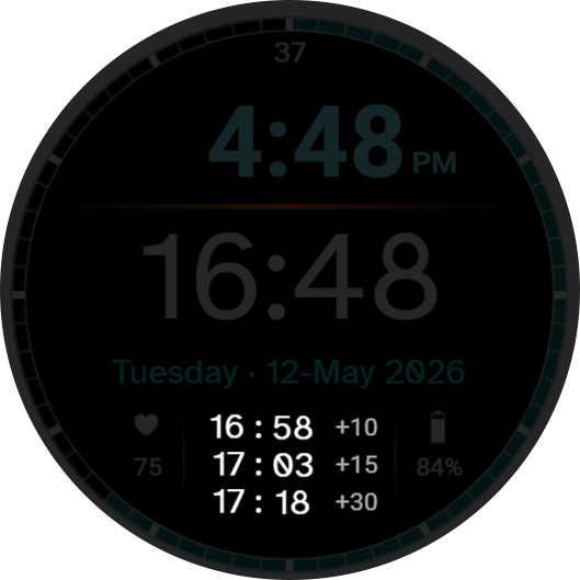
Using techniques I developed on earlier watch faces for calculating and shifting time values, I built a feature called Shift Offsets. Centered at the bottom of the screen are three rows of 24-hour clocks labeled +10, +15, and +30. These lines automatically calculate and display what the 24-hour time will be 10, 15, or 30 minutes into the future.
For instance, if the current time is 16:48, the offsets immediately show 16:58 (+10), 17:03 (+15), and 17:18 (+30). I chose these three intervals because adding an hour in your head is relatively simple, but adding 10, 15, or 30 minutes to an odd timestamp is where the quick reference helps most.
(A quick disclaimer: Daylight Saving Time transitions are not calculated into these offset clocks. If it is 01:58 AM right before the clocks shift back an hour, the offsets will not anticipate that jump, as handling regional DST rules is not supported within the watch face format. Use standard caution around the 2:00 AM transition during those specific dates.)
The Timer Problem
With the time offsets in place, I was very happy with the layout. Though I eventually lost touch with the original Reddit requester, I was already too invested in solving the problem to stop. I now needed a way to tackle the timer issue I had set aside earlier.
The timer was the most obvious tool for a nurse, but it also proved to be the most challenging because you cannot easily start a native timer using the Watch Face Format. You can create a shortcut to an external timer app, but that takes you completely away from the watch face, and I really did not want to do that.
I discovered that I could display a series of images frame by frame. I opened my video editing software, created a simple counter counting from 0 to 59, and rendered it at one frame per second. This seemed like a solid possibility, and I had it working.
However, it quickly fell apart when the watch went to sleep. When that happened, the animation stopped, and waking up the watch reset the counter back to zero. The only way to make it work would be to tap the screen continuously to keep the watch awake, but nurses have enough on their plate without having to babysit a timer.
Even beyond that, I noticed the frame sequence would occasionally drift by a couple of seconds over the course of a minute. That was unacceptable because accuracy is critical. A timer that drifts could impact timing between medication passes or observations. While this is not a medical device, it still should not be inaccurate. I needed a mechanism tied directly to the watch’s internal hardware clock so it would stay perfectly accurate.
Back to the drawing board.
The 12-Node Breakthrough: The Illusion of a Timer
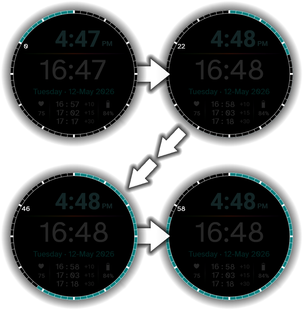
In reality, these are not “real” timers at all. But as it turned out, a real timer was not actually necessary. With a little imagination, determination, and some creative math, the illusion of a timer gets the job done better than I thought possible given the strict limitations of the Watch Face Format.
Instead of fighting the platform to script an artificial stopwatch, I mapped 12 synchronized countdown nodes to the continuous 60-second outer bezel sweep.
From the user’s perspective, it feels just like starting a dedicated timer: you simply tap the 5-second marker immediately ahead of the live sweep.
Say the seconds sweep is passing the 9 o’clock position (45 seconds into the minute). You tap the 10 o’clock position. A counter appears and counts down: “55”, “56”, “57”, “58”, “59”, and finally “0” (top left image) right as the sweep arrives. That countdown gives you a few seconds to get ready, and the timer immediately counts up from “0” to “59” as the sweep completes a full revolution. When finished, a single tap hides it.
Behind the scenes, you are not starting a new timer engine from scratch. You are simply revealing one of 12 preset nodes around the perimeter that is already synchronized to hit “0” when the sweep arrives at its marker. Because they are spaced evenly around the dial, you are never more than 5 seconds away from starting a count.
Always-On Display and Sweep Orientation
In Always-On Display (AOD) mode, Wear OS limits screen updates to once per minute to preserve battery. Leaving a running digit on screen would look frozen. Instead, a solid status dot appears precisely where your active timer node is located. The moment you wake the watch, the live digits and sweep reappear exactly where they should be, perfectly synchronized with the internal clock.
If you ever lose track of whether you started your timer on the current minute or the previous minute, the outer seconds ring acts as a secondary check: it fills on odd minutes and empties on even minutes, giving you a quick visual reminder of where you began.
Shift-Ready Utility and Interactive Shortcuts
For extra utility, I added four complication shortcut zones flanking the 24-hour clock: two on the left and two on the right. These give you dedicated spots to launch your most-used shift apps, calculators, or hospital tools without crowding the dial.
Battery life is critical during long shifts, so the battery readout is displayed prominently. It remains white during normal operation, shifts to Amber at 20% or below, and turns Red at 10% or below to give you clear notice before your watch runs out of power. A heart rate readout is also included on the lower left.
Several built-in tap actions make navigation quick:
- Tapping the Shift Offsets opens the Alarm app.
- Tapping the Battery launches the system Battery settings.
- Tapping the Heart Rate launches the Heart Rate tool.
- Tapping the Date opens your Calendar.
Having these common tools mapped directly to the dial keeps the four complication slots completely free for your own custom shortcuts.
Bringing It to the Floor
What started as a simple request for a nurse watch face on Reddit turned into a rewarding design and engineering project. Because I am not a nurse myself, I relied on careful research, empathy, and feedback from healthcare professionals.
When I showed an early build to a nurse, their first question was, “Does the timer stay running when the screen dims?”
Being able to demonstrate that it did, and hearing them say, “I would definitely use this,” made solving all of those Watch Face Format challenges worthwhile.
I look forward to hearing feedback from the community once Charting Time is officially released!

User Manual
Launch Celebration: Claim a Free Code
To celebrate the launch of Charting Time, I am giving away free Google Play promo codes directly through the lab. Grab yours below while supplies last.
