Update: Peek Hour is now live on the Google Play Store! Thank you to the dedicated testers who helped refine this project. You can download the official production version here. The original text below has been lightly edited to remove outdated beta signup instructions.
I’ve been heads-down in the lab lately, building Peek Hour, a new project that solves a problem I’ve had since I bought my first smartwatch.
I noticed a trend in Wear OS watch faces: many are designed to look like complex mechanical watches with realistic gears and shadows, or they pack as much data as possible onto the screen.
While those styles look great, they weren’t quite what I needed. I wanted a face designed specifically for a smartwatch. I wanted one that prioritizes efficiency and simplicity over simulation.
Today, I’m excited to announce that Peek Hour is finally in Beta.
The Philosophy: Why “12:16” Feels Wrong
Do you remember how people told time before digital watches? If the minute hand was somewhere near the 3, you didn’t say “It is 12:16.” You said, “It’s quarter after twelve.”
This is “Fuzzy Time,” knowing roughly where you are in the hour without obsessing over the exact minute. It was fuzzy, but it was intuitive.
When I switched to digital, I suddenly felt ridiculous reading off precise numbers. To me, decoding “10:42” feels like it requires more brain processing power than simply glancing at the position of the hour hand.
This becomes a real problem at night. If I wake up and glance at my wrist, reading a precise number engages my brain just enough to wake me up. I don’t always need to know the minute.
If I see a large “2”, I know I can go back to sleep. But if I see a “6” (and my alarm is set for 7:00), I just need to know: Is it the beginning of the hour (sleep more) or the end of the hour (get up soon)?
Enter Peek Hour: The Visual Time Gauge
I built Peek Hour to bring that “analog intuition” back to the digital screen.
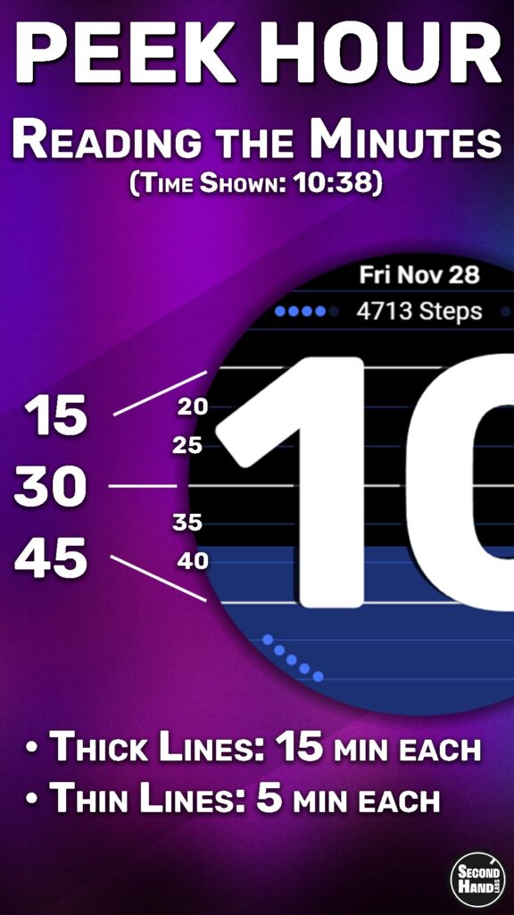
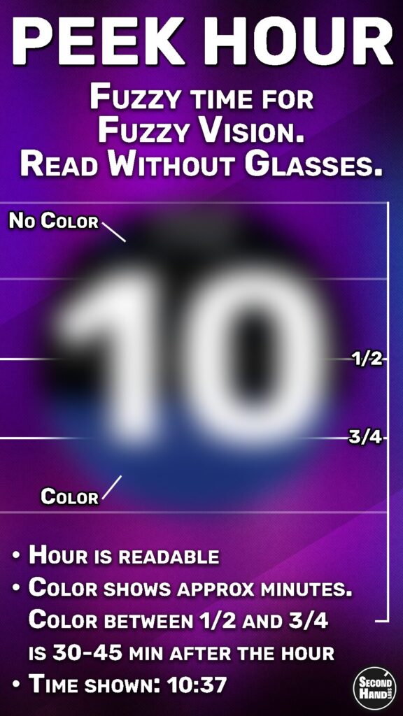
Instead of forcing you to read numbers first, it uses a Visual Time Gauge. The background color “drains” out of the watch as the hour passes.
- Full Color: Top of the hour.
- Half/Half: Half past.
- Mostly Black: The hour is almost over.
It allows you to decode the time instantly (day or night, with or without glasses) using what feels like zero brain power. It’s cleaner, simpler, and less jarring in the dark.
(And for the control freaks: Yes, you can tap the screen to “Peek” at the exact minute if you really need it!)
Features at a Glance
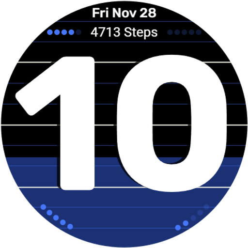
- Minimalist, High-Contrast Design: Built for maximum readability on Pixel Watch and Galaxy Watch.
- Data without Clutter: Your step count is displayed clearly, while Goal Progress and Battery levels are visualized as subtle dots to keep the screen clean.
- The “Peek” Mode: Tap to reveal precise minutes inside the hour digits.
- Smart AOD (Always On Display): Optimized for four things:
- Battery Life: Minimal pixels used.
- Night Viewing: Dim enough to not wake you up.
- No Glasses Needed: Large, distinct hour digits.
- Low “Brain Energy”: Instantly readable when groggy.

The Technical Journey
Getting this onto your wrist was a longer road than I expected. Building the watch face was the fun part, but navigating the Google Play Console, building a custom Android companion app with Android Studio from scratch, and setting up professional development workflows was the hard part.
It has been a crash course in Android development, but I’m proud of the result.
Now Available
👉 Get Peek Hour on Google Play
Keep on ticking,
Second Hand Labs