
Contents
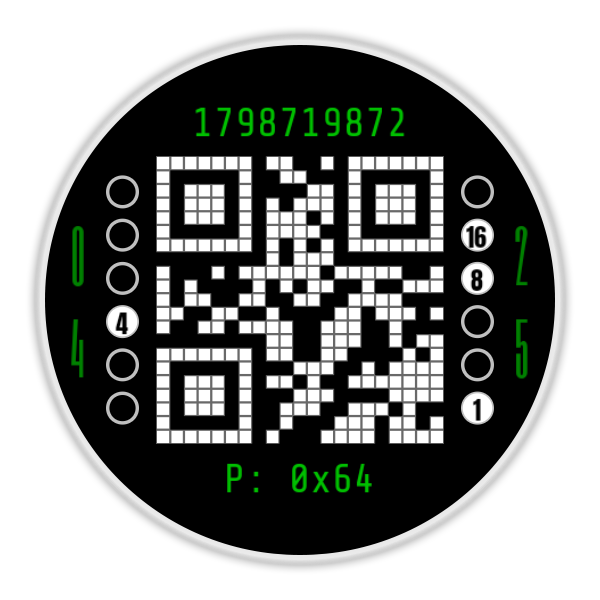
Developing watch faces at Second Hand Labs is a slow and methodical process. The smartwatch market is already saturated with great-looking, densely packed watch faces alongside gorgeous, hyper-minimal designs. Those styles look fantastic, but with the QR 21 watch face, I take a slightly different approach.
My focus is on creating unconventional, unique designs that serve a distinct purpose, tackle an engineering challenge, or offer functionality that you are not likely to find elsewhere.
As a developer, I enjoy the challenge of defining an unusual problem and figuring out how to solve it. When a concept seems challenging, I don’t let that discourage me. I don’t like to compromise or take the easy way out. For instance, if I want to do four things, I won’t do only three just because one of them is hard. I will keep at it until all four are implemented, or unless I determine that a different path will provide a better result. I’ll continue to work through different ideas until the seemingly impossible becomes possible.
That curiosity is exactly how the QR 21 watch face came to be. I started to wonder whether it would be possible to create a watch face with an authentic, scannable QR code that updates every single minute, while living entirely within the strict limitations of the modern Watch Face Format.
The QR Code Challenge
The modern Watch Face Format is designed primarily to preserve battery life and maintain system efficiency. Delivering a dynamic, scannable QR code meant working thoughtfully within those parameters, adapting to the platform, and coming up with a creative engineering solution.
One way to have a QR code tell the time is for the code, when scanned with a phone, to redirect the phone’s browser to a website that shows the current time. While that works, I wanted more than that. I wanted a new QR code to appear each minute so that the code itself directly encodes the current time. It needed to be the actual timepiece, working completely offline, independent of any websites or data connections, and running without lag, battery drain, or memory bloat.
After a lot of trial, error, and deep optimization, I engineered a way to make it happen. The QR 21 watch face does exactly what I set out to do: seamlessly serve the exact time payload for every minute of the day with virtually no impact on system performance, all packed into a lightweight download less than 1.5MB.
The ironic part of all of it, of course, is that the phone you use to scan the QR code already shows the time, making a QR code watch face arguably pointless. I thought about stopping there and making Module 21 (its early working title) as sort of a joke watch face that makes no logical sense, but I instead decided to continue pushing forward. The QR code was only the start.
Leaning Into the Geek Factor
I started thinking about other non-conventional ways to represent numbers and time, and Unix time came to mind. What is more geeky than displaying the number of seconds elapsed since January 1, 1970 at midnight UTC? Per Wikipedia:
Unix time[a] is a date and time representation widely used in computing. It measures time by the number of non-leap seconds that have elapsed since 00:00:00 UTC on 1 January 1970, the Unix epoch. For example, at midnight on 1 January 2010, Unix time was 1262304000.
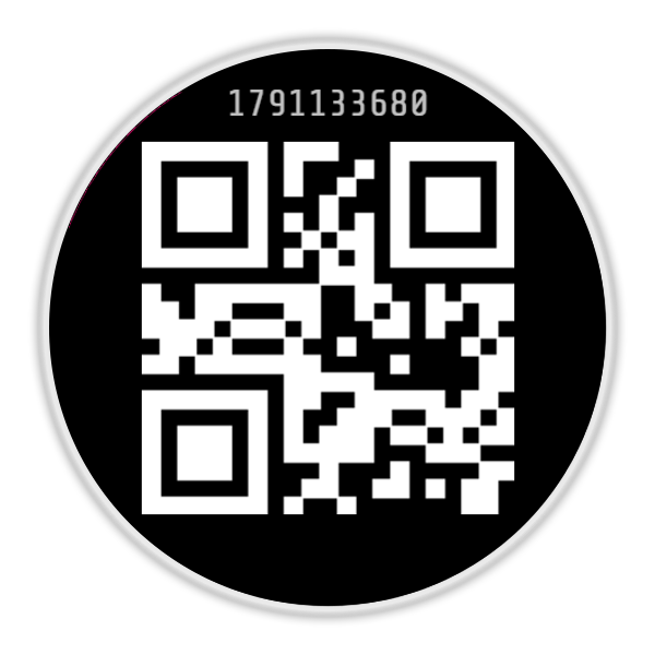
Like the QR code, Unix time can’t be accurately decoded without some sort of computer assistance. Not deterred, Unix time got added and appears right above the QR code. For every second that passes, Unix time increments and as of this writing, it’s 1787087617.
With Unix time added, I wanted to include another clock, not just because three clocks would be cool, but because I enjoyed the challenge that creating each one presented. Plus, there was still room to the left and right of the QR code to fit in another clock.
At their core, computers work in binary, and unlike Unix time and the QR code where you have zero chance of reading them on the fly, binary is different. With a little effort, it can be read by humans once you understand the layout. I didn’t need much convincing and quickly got to work building a binary clock.
Time is split into two columns: hours on the left and minutes on the right, each made up of a vertical stack of six circles. When a circle is filled, the bit is “on” (enabled); when hollow, the bit is “off” (disabled).
Each position in the column has a set value that doubles as you move upward from the bottom: 1, 2, 4, 8, 16, and 32. To tell the time in standard mode, you simply add up the values of the filled circles in each column. For anyone familiar with binary, it works intuitively, though doing the mental math on unlabelled circles can still take a moment.
To give the rest of us a fighting chance, I created an Assist Mode where each circle directly displays its numeric value when active. Hollow circles remain blank, while filled circles illuminate with their numbers. If the 1, 2, and 8 circles light up on the left column, the hour is 11 (1 + 2 + 8). If the 2, 8, and 16 circles light up on the right, the minute is 26 (2 + 8 + 16). Having those numbers visibly light up makes decoding the time an effortless calculation for anyone.
Battery Power, and a Complicated Decision
I did want to display at least one system stat: the battery power. Instead of using a standard 0 to 100 percentage, I decided to display the battery power in hexadecimal. In this system, 0x64 is equivalent to 100% full power, while 0x32 is equivalent to 50% power remaining.
I know complications are important to many people. However, complications cannot be altered to display unique values such as hex or binary, and to stay true to this watch face’s theme, I felt that displaying “normal” values was not part of its vocabulary. As a result, I made the tough decision to leave complications out. I know this will be a deal-breaker for some, but there are plenty of watch faces out there with complications, and I was not convinced someone would use the QR 21 watch face as their daily driver. If you do, please let me know and I may need to reconsider my decision!
Do I Really Need to Add a Regular Digital Clock?
At Second Hand Labs, it’s important that I not only design watch faces, but that I use them as well. Eating your own dog food, as they say, is an important part of the process. At this point, I began testing QR 21 and honestly, I found it frustrating. Really frustrating. Without having the time available at a quick glance, it became a challenge, especially when I was in a rush.
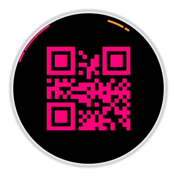
I knew I needed to add a conventional clock, and reluctantly decided to add an analog-style time telling system. I still wanted it to fit the theme and first tested out a hands-free concept. Instead of hands, I tried using a small (hours) and large (minutes) arc circling the outside of the watch face.
It worked fairly well, but due to their size, it was difficult to tell the exact time. I then added 5-minute markers and suddenly QR 21 was starting to look quite cluttered, plus the arcs were still difficult to read. I then tried black markers that showed up only when the arc was over them, but that really didn’t look as good as I hoped. The best part of the arcs was the name I gave them. It was super cool, though I won’t mention it here in case I choose to use it again in another watch face design.
After a few weeks of testing, I abandoned the analog arcs and decided to go with a digital time display. I needed to find a way for it to be included, but not steal the focus. It couldn’t be the first thing noticed when seeing the QR 21 watch face for the first time.
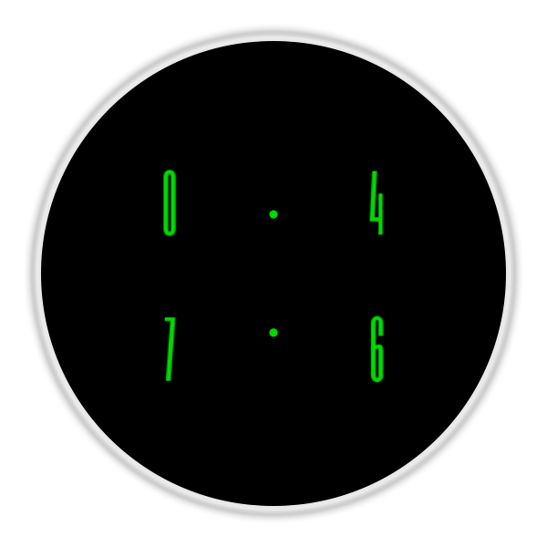
Like the binary clock, the digits are split with hours on the left and minutes on the right, stacked vertically. For example, 12:05 displays as a 1 stacked over a 2 on the left, and a 0 stacked over a 5 on the right. Space was tight, since the binary clock was already on both sides of the QR code, so I searched for and found an extremely tall, narrow font that would work perfectly.
Choosing the right font was critical. I did not want to undermine the theme of the QR 21 watch face with an obvious, standard digital clock. At first glance, this tall, thin font looks like part of the surrounding graphic design rather than actual numbers. I spent a lot of time adjusting the size and location until it felt just right.
Rethinking the Always-On Display
The earliest versions of the QR 21 watch face handled the Always-On Display quite differently. With the main focus on the QR code, I originally kept the QR code visible on the ambient display. I did this because I had a couple of specific use cases in mind:
- Quick Scanning for Logs: An always-available QR code could be handy if you are filling out a log sheet or timestamping inventory. If you are already holding a barcode scanner, you could easily scan your wrist to drop in the current time. This was a highly specialized use case, but one that could be useful in certain circumstances. While handy, some barcode scanners include a book of useful QR codes where one actually tells the scanner to output the current date/time. So this feature’s usefulness was mixed.
- Assistive Tech for Low Vision: I wondered if people with low vision who use smart glasses could benefit from having a QR code available at all times. I thought that when encountering a QR code, the glasses might automatically read the time aloud. I later found out that you have to actively trigger the glasses to decode a QR code, which defeated the purpose of a quick, discreet glance. I reached out to a low vision group, and the consensus was that this would not really be helpful in practice.
I am extremely careful when it comes to Always-On Display battery usage. AOD is a great feature, but only if it doesn’t use too much power. A power-hungry AOD may not even last a day. Google has strict power limits for AOD, and I do not like designing an AOD display that rides just below the maximum allowed. I’d rather stay well below these limits. While I managed to keep the ambient QR matrix below Google’s max, it was only just below and used way too much power for my taste. Despite my desire for the QR code to be visible at all times, battery power was more important, so the QR code in AOD had to go.
Once I added the tall digital font, I decided to use that instead for the Always-On Display. When transitioning to ambient mode, the digital numbers animate inward from the sides of the dial toward the center and grow slightly in size. The result is a clean, stylized digital clock that protects your battery while keeping the aesthetic of the QR 21 watch face intact.
If the digital clock is disabled, but you have AOD enabled, have no fear. The digital clock fades in and slides into place when AOD is activated, and then fades out when the normal display returns. This was my first watch face that used an animated transition to/from AOD and I am happy with the results.
Seven QR Stencil Styles
Once everything was working, it was time to have a bit of fun. Who doesn’t love lots of options to customize the look of your watch face? I sure do. The QR code was given 7 different styles to choose from, all tested and scannable. Grid, Circles, Diamonds, and even Hearts can be selected, to name a few. 28 Color themes were added as well to fit your style.
Final Thoughts
All in all, QR 21 has been a very rewarding development experience. Each element on this dial could easily have been its own watch face, but I chose to combine all four. You can toggle off any element you do not want to see, except for the QR code itself since it is the central theme and namesake of the project. (If you were wondering, the “21” in the name comes from the fact that these standard Version 1 QR codes are exactly 21 by 21 pixels).
It supports both 12-hour (such as 3:42 PM) and 24-hour modes (such as 15:42), switching seamlessly depending on your phone and system settings.
That is the story behind the QR 21 watch face. A lot of thought went into building it, its geek factor is off the charts, and it taught me quite a bit about what can be done inside the watch face format when you refuse to accept platform limits as a stopping point.
User Manual
Launch Celebration: Claim a Free Code
To celebrate the launch of QR 21, I am giving away free Google Play promo codes directly through the lab. Grab yours below while supplies last.
